As a UX/usability designer, one of the things that I always consider when designing interfaces and experiences is what’s known as Information Architecture (IA). IA is an important part of designing any information system. It is the scaffolding that supports the usability of that system. I’ve always considered maps as data systems. They have different users, serve different purposes, and can have all sorts of different types of data presented on them.
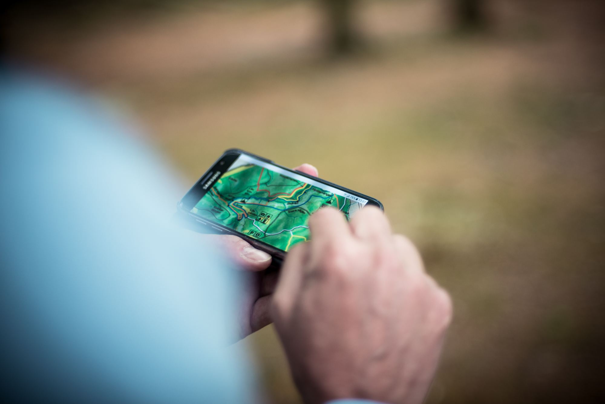
When you’re designing a map, how do you apply some of the rules and concepts of information architecture–rules and concepts that many designers have used to help make sense of very complex information systems–to consumer facing web maps?
The default Google Map gets used all the time on the web. The default functionality does a really good job at giving directions, finding cafés and restaurants, transit, and just day-to-day consumer uses. But if that’s not the context of your map, and it’s not your users’ goals, then it’s not likely to be the best solution for your web map.
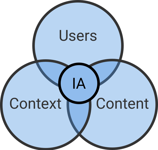
A good starting point is to look at the intersection of users, content, and context. This is what’s known as Information Ecology and it’s an important part of information architecture. Let’s apply this concept to the web map on the contact page of sparkgeo.com
The User and Their Goals
At the top of any usability designer’s list of priorities is the user and their goals. In our case the user is somebody probably much like you, dear reader, who’s looking for Sparkgeo’s services or maybe just wants to find out more about us and what we do and get in touch.
The Context of the Information
In our case, the context is the website that this map is embedded on. More specifically, the Contact page. However, this map isn’t intended to actually guide you to the front door of our office in Prince George as we’re not the type of company that takes walk-ins (this is why there’s no pin on the map). That’s not to say you’re not welcome to come in from the cold for a cup of coffee if you’re in the neighbourhood. But since most of our team is remote, your best bet is to just stay where you are and send an email to [email protected].
The Content–the Actual Information
This is where a service like Mapbox or Google Maps APIs Styling Wizard can really prove to be useful. These services allow you to turn different map features on and off and highlight specific ones. Allowing you to highlight the content that will enable your users to achieve their goals. Unlike the information-saturated default Google Map that all-too-often gets tossed onto consumer-facing sites. We previously had a default Google Map on our Contact page and it listed The Keg Restaurant. I don’t think that our users are on our contact page to get direction to the Keg. This goes against one of the 10 usability heuristics of UX as defined by Jakob Nielsen.
#8. Aesthetic and minimalist design
Dialogues should not contain information which is irrelevant or rarely needed. Every extra unit of information in a dialogue competes with the relevant units of information and diminishes their relative visibility.
I kept these three important things in mind when building the web map for the contact page.
The Result
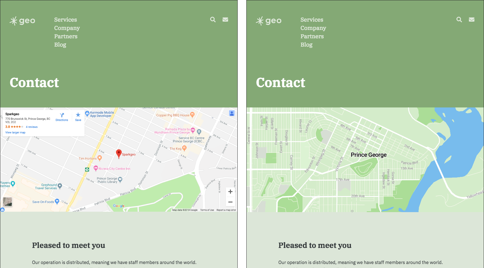
Our Contact page before and after custom web map cartography. Specifically, the simple and accessible cartography that can be achieved via Mapbox and other services of that nature. Our updated web map now achieves our users’ goals, has the content that our users need, fits the context of the site, and as a bonus fits our branding too. (Sparkgeo has just recently rebranded and one of the aspects of our new brand is a palate of different pastel colours–as I’m sure you’ve noticed on this site). Our new Contact map has succinct information on it that tells the simple story of Sparkgeo’s off-the-beaten-path office location.
Consider these three important pieces when you’re designing any information system and think about how you can use this, and other information architecture methods to improve any map that you make for your users.
Wait, you’re not done.
You can’t improve something you don’t measure. A major part of a designer’s job is to make ongoing improvements to design. It’s unlikely that you’re ever going to create the perfect map the first time, so be prepared to collect data, iterate, and improve. This is why we built Maptiks. Maptiks is a Software-as-a-Service that is easy to install on your map and gives you real-time analytics. It’s a good first step in making sure that your users are achieving their goals with your all your connected maps.